Innovation and Insight in the Contemporary Architecture of Additions
If you want to understand the state of a nation, look at its architecture, and more particularly, how it is handling possibly the most sensitive of architectural bellwethers, the architecture of additions. Additions, after all, have a standard for judgment built into them: how are the old and the new getting along? In recent additions, how is the new understanding and treating the old, and how is it enlisting it in its propositions about our new problems and possibilities?
In reaching a judgment about the state of the art of additions, it is crucial to remember one ground rule: it doesn’t matter what they look like. By the measure of additions, probably the biggest single indicator of trouble in the United States is the quantity of imitation-old architecture across the nation and the number of additions battered into sameness by regulators afraid to think. A nation deep in denial loves the imitation, pastiche, and sameness of look-alike architecture. Additions made with the brain engaged, however, build on the truth that what matters is not looks but meaning. What matters is what the new and the old in their differing expressions say together about their evolving subject matter, the way the new and the old are brought to collaborate across their difference to make vivid what needs to be realized today. The old is not old text for veneration but old architecture to be honored in use, a good-faith working proposal about its times that we are lucky enough still to have around to help us make sense of ours.
By this measure, contemporary additions offer considerable grounds for hope, indeed even suggest that we are changing direction as we try to find ways to survive the catastrophic start of the 21st century at the World Trade Center. A reference through which to see both the state of the art of additions and the possible shift in sensibility is set by Bernard Tschumi’s Le Fresnoy Art Center, in Tourcoing, France. Tschumi was operating in optimistic, wealthy, and ambitious times towards the end of the 20th century, and he was operating for one of history’s great public clients, the government of France. He was charged with making a home for a score of over-privileged French students that the nation wanted to learn to make “popular” art on the expressive frontier. Tschumi’s site was in a working-class suburb of the big industrial city of Lille inhabited by some friendly, old, largely abandoned venues for circuses, wrestling, and similar popular events.
The coup of his competition proposal was the idea of the superroof over these building to save them as large-volume studios while joining them in the larger enterprise of the school. The super-roof took advantage of contemporary thinking about materials and assemblies to land the school like an apparition in the scraggly trees of its site with the logo “LeFresnoy” cut into its “cutting” edge and to create for its inner workings a sheltering sky. In between the old arenas and the new sky, Tschumi developed a shadowy wonderland of angular ramps and walkways that looked more than anything like what you would see on the screen in Form Z or in a video game: built cyberspace. Let down like a landing ramp under the leading edge of the apparition, the monumental stair made clear that the creation and experience of this world was the point of the enterprise. The vertiginous, perforated-metal stair was another serious “folly,” a way of getting into and beginning to make sense of the strange and frightening world of the contemporary popular imagination.
Tschumi’s response to the old arenas was exemplary. He went out of his way to honor them in use, arguing that they were in the end a cheap way to get large volume spaces. Then he made them major players in the development of the meaning of the combination, using their relative size to make clear the vastness of the imaginary world we have entered and to anchor his evocation of it in old notions of popular entertainment, showing both the age and the continuity of the enterprise. In his hands, the old grounded and served the new’s marvelous expressive adventure.
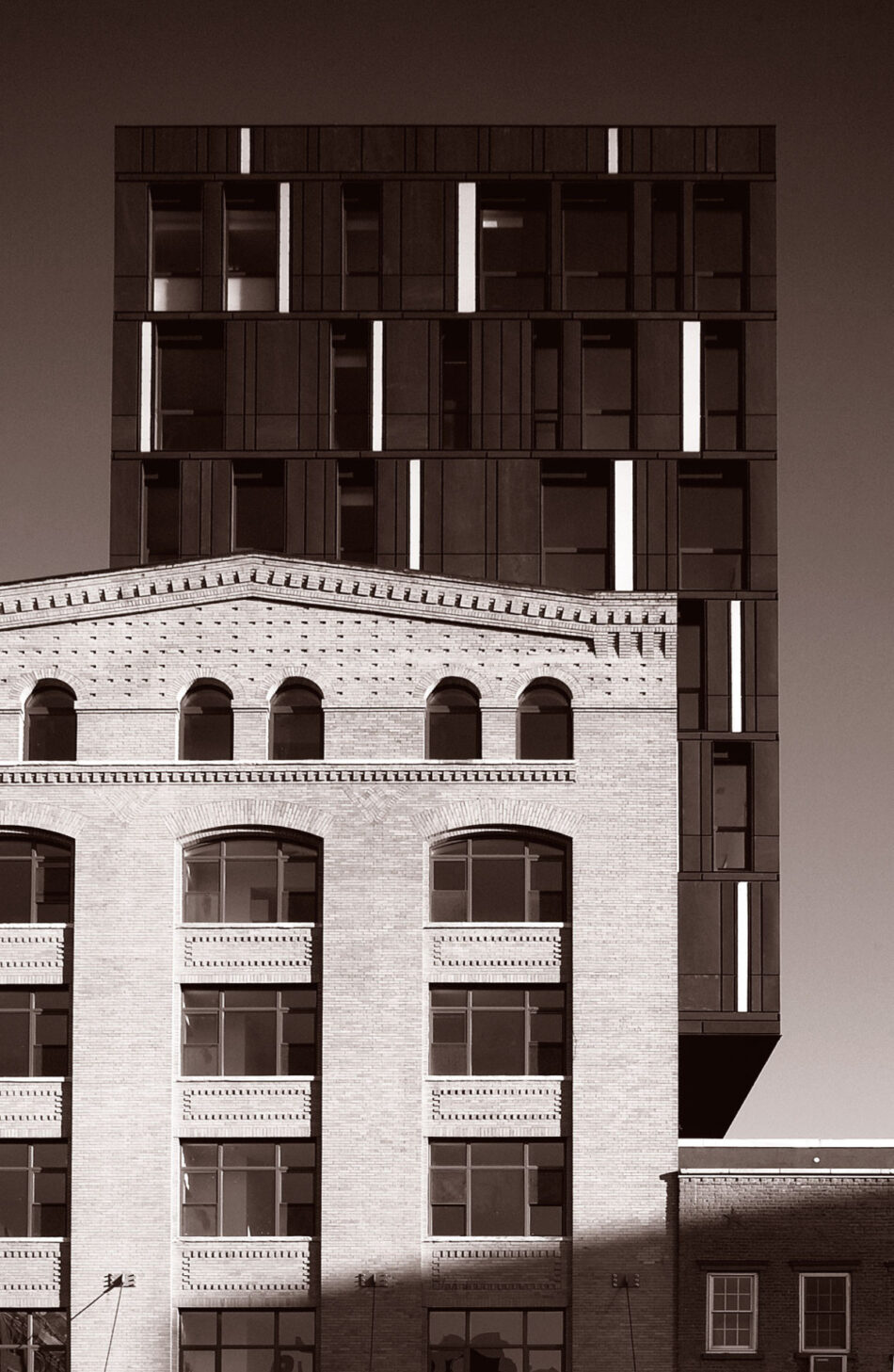
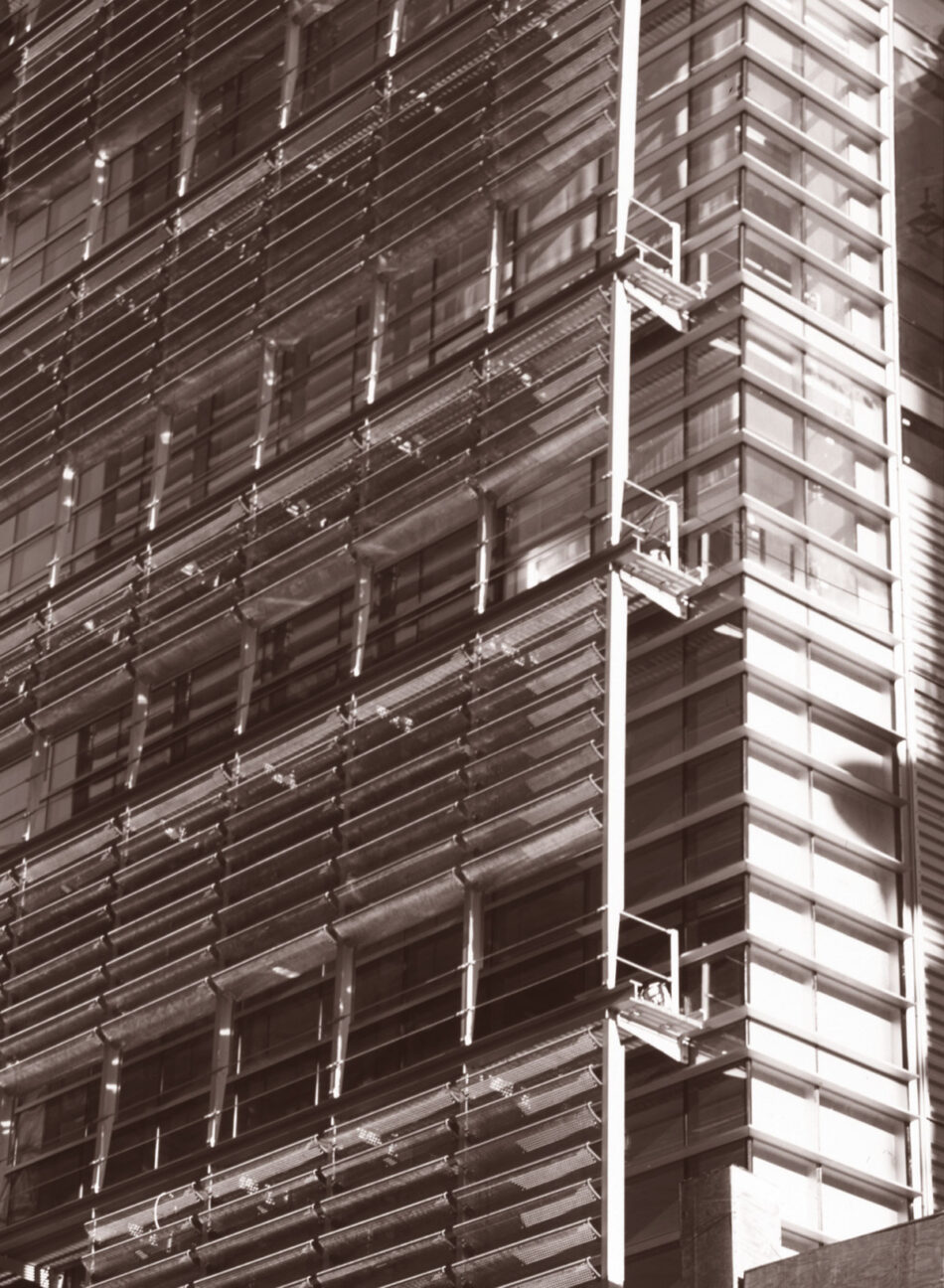
The standard Tschumi set was not necessarily accessible to everyone not supported by French gloire, nor was it applicable to even slightly later times with their fast-shriveling commitment to the public interest and fast-vanishing government funds. Still, the boldness of it continues to show in tightly budgeted private real estate development projects like SHoP Architect’s Porterhouse just outside the meatpacking historic district in New York City. SHoP Architects is a young firm interested in the extraordinary tectonic and expressive possibilities opening up for us through our wealth of materials and computer control as we act in our oldest role as makers of instruments of insight, understanding, and human service. In its young life, SHoP has made an extended exploration of the possibilities for form of complex assemblies of small, precisely fabricated, precisely put-together bits. Given the current high sale prices of well-located urban residential real estate, SHoP had the right context to continue its effort to demonstrate that its approach could actually yield economies.
The starting place was an attractive, obviously strong brick warehouse, with just enough vernacular Deco corbelling and other brick detail to come out with an expressive identity nicely representative of early-20th-century commerce. SHoP’s added box of space sits with remarkable directness off-center on top of it, sticking way down into the old warehouse and out beyond it ten feet on the side. The surface expression of the added box in engineered zinc is completely fresh—rhythmical vertical slots for windows that also hold plain vertical neon lamps—all adding up to a vertical box much like the original in size but nearly black where the old is light tan. The crucial detail of the assembly, though, is the way the new sticks into the old with the unbraced cantilever that sets it off center. Nothing calls attention to the cantilever—no big braces like the famous cornice braces at Frank Gehry’s Berklee School (formerly Tower Records) in Boston or Ernesto Rogers’s bulging tower in Milan. Nothing tries to schmutz it over, no fancy turn-of-the-(last)-century obscuring cornices or string courses. The eccentric loading of the same-size, different, new box on the shoulder of the old warehouse suggests a partnership of acrobats, an equilibrated association—as the old definition of partnership goes—of friends and equals joined for a common business purpose. The combination has no fancy program: it’s all just speculative New York “real estate.” But the partnership of old and new works together as easily and naturally as night and day. Indeed it works particularly well at night when the neon of the new draws the old and the new together to engage the larger expressive spectacle of the city.
The Porterhouse is an interesting exploration of new ways to expand old buildings up without putting them down. In times that valued symmetry above almost all else, additions on top almost automatically reduced the old bottom to the status of bearer—the old working for the new as in the Boston Custom House or Marcel Breuer’s 1968 Grand Central tower proposal. Asymmetrical compositions—richly explored by the Moderns and now possible to realize vertically with our technology, our wealth, and the unorthodox contemporary architectural imagination—offer new ways to make the old and new equal players, subordinating neither in complex compositions. Wood and Zapata’s proposed addition to New York’s Ladies Mile Historic District seems to go after these possibilities in the cantilever that generates its form—though it is entangled up to the knees by a web of preservation “guidelines” calling for arbitrary matches and cornice lines.
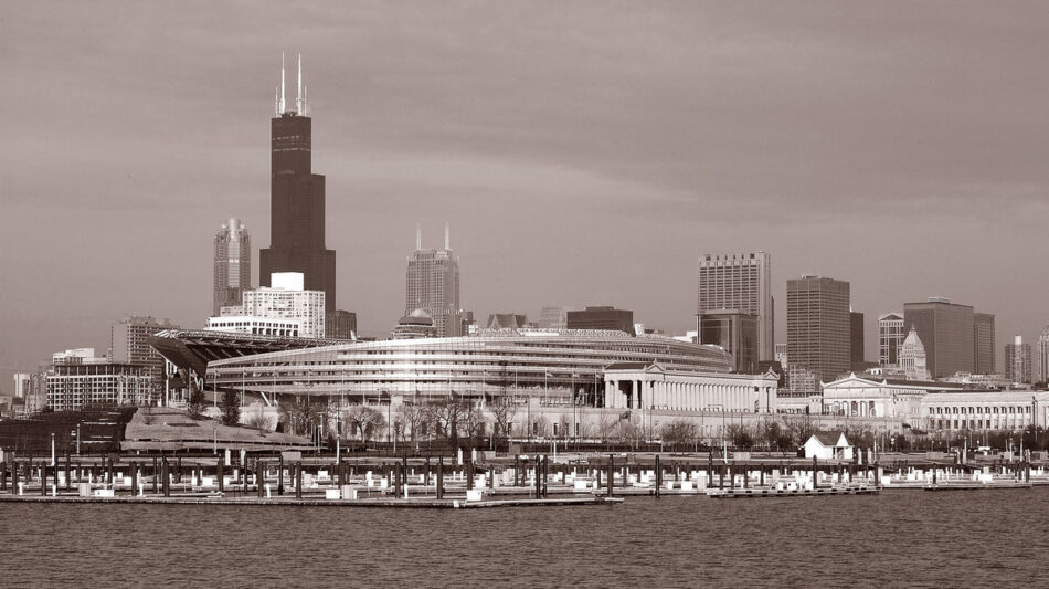
Comparably inventive and bold is Wood and Zapata’s expansion of Soldier Field in Chicago. The strength of the addition is a wholly appropriate response to the landmark prominence of the 1920s football stadium, a good way to enlist the static strength and reassurance of its plain classical colonnades in a much enlarged and energized contemporary place of popular assembly. The two smooth horizontal C sections of the addition run behind the colonnades, accelerating up and back from tapered ends to show off, at the climax of their trajectory, the different fixed gray rhythm of the ground-gripping old stone columns. The open end of the stadium is animated now by the sharp ends of the addition, a contemporary balance of power and movement in flight, supported by the groundedness so crucial to the meaning of the colonnades. The big smooth new pieces pass fast and close behind the old, but the result doesn’t feel like conflict: the old holds its own with a reminder of the conventions that are still around to comfort us as we engage new challenges.
Stimulating us with bold explorations is one thing these new additions do for us, but possibly not the most important. Additions are also an extraordinary vehicle for interpretation, one especially important as we try to understand where we are in the midst of the ethical challenges of the post-World Trade Center world and, particularly, the American response to it.
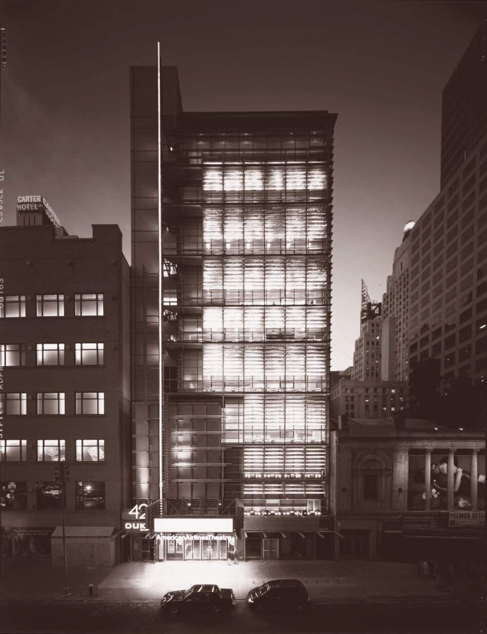
The New 42nd Street Studios in New York starts before the catastrophe, in the midst of a large postmodern public initiative to raise revenue from tourists and out-of-towners by inducing them to spend money on the ever-so-slightly titillating kitsch of 42nd Street. The 42nd Street Entertainment District—handmaiden of the much larger Times Square redevelopment—wasn’t quite a casino, but it depended on a Vegas-like simulation of old bawdry, a mixture of old theaters and fake old theaters, offices and hotels blazing signage in period lights and graphics, all as called for by a made-up vision of naughty old 42nd Street projected by Robert A. M. Stern. In a startling establishment of the contemporary willingness to accept fake for real—indeed to enforce it—the huckster’s vision of 42nd Street was protected by a historic review board as if it were real.
The commercial development, after its payments to the developers and to the city, produced a squirt of money for the arts—yes, somewhere underneath the culture of “shows,” there are actual artists performing. This squirt of money ran to a not-for-profit, the New 42nd Street Studios, which undertook to foster real shows in a building of studios and rehearsal spaces. The firm where I work, Platt Byard Dovell White, built the studios in a twelve-story addition to the Entertainment District with an alternative “signage” faithful to the art this part of the project served. On the front of the display of actual artists at work within the building’s glass envelope, Charles Platt and Ray Dovell hung an eight-story collage of perforated metal and glass holding up to the street a continuous abstract light show. The show was run in part by the arc of the sun pulling color from dichroic glass and partly by classic theatrical par lamps shining up on vanes of stainless steel that were perforated, bent, and ground. The light on the vanes was animated by an infinitely variable computer program designed by Anne Militello of Vortex Lighting to drive the lamps.
The light show was and is arresting for its difference, its variety, for its occasional startling beauty—and for the fact that it has as the old-fashioned analogue genuineness of a mechanical assembly, not an LED, that has to do with real theater. It has no words: in a heroic commitment to art and authenticity, the Studios forwent the millions of dollars of revenue from advertising sold by everyone else. It only talks in color and light—the essence of the District’s kitsch—and its motion, like those of music and dance, has to do only with time and rhythm; it displays no movies or simulations. Because of the way the vanes are coarsely hand-ground, the diffused light has an appropriately gaudy edge.
Like other additions, the Studios is a tool for illuminating difference, for holding things up against each other so they can be understood. What it shows up here is highly complex—notably, the complex concept of “reality” we have to navigate in the world we have created. The Studios represents artists in the middle of the blazing late-20th-century baroque artifice of the 42nd Street redevelopment by doing what artists do for us, not just offering us but arresting us with a chance to confront what we have wrought.
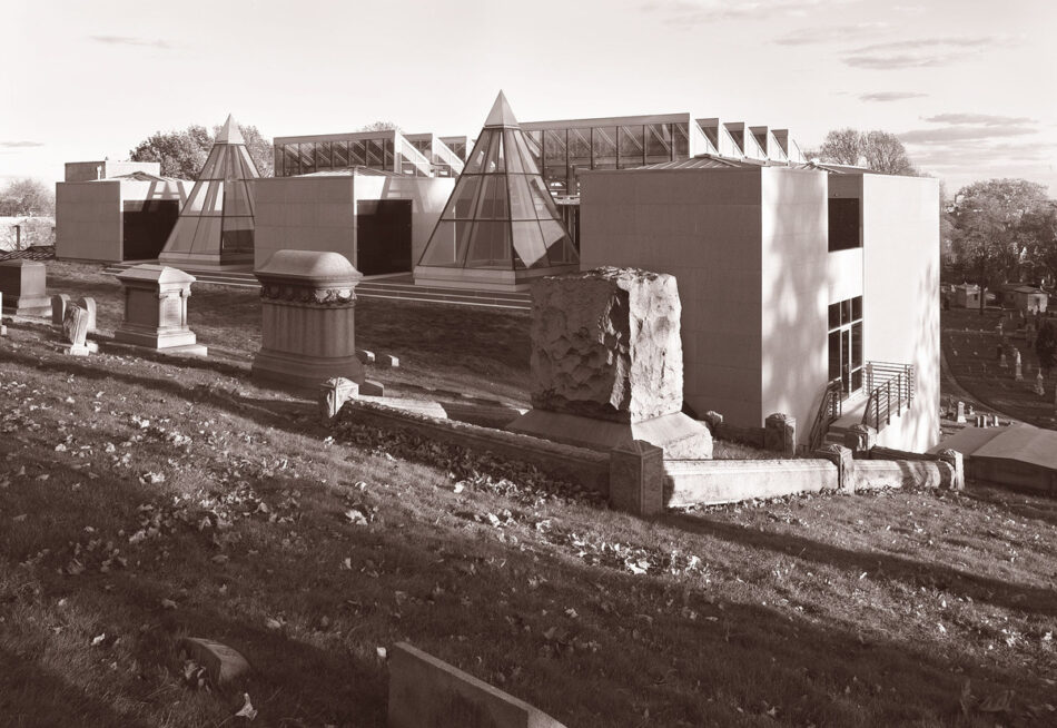
Platt Byard Dovell White’s later Hillside Mausoleum is a bridge across the catastrophe of the World Trade Center, a meditation on death and memorialization within sight of the disaster. Hillside is an addition to a fascinating manifestation of early 19th-century romanticism, Brooklyn’s Green-Wood Cemetery. Green-Wood’s pastoral landscape was designed in 1838 to offer a new, reflective, and consoling view of death as part of life, a system of paths and monuments intended to stimulate graceful movement and meditation in a paradisal mixture of nature and artifice. The ancestor and inspiration for Central Park and Prospect Park, Green-Wood is also a rare pastoral cemetery that still accepts burials.
Under the hand of designer Ray Dovell, the Hillside Mausoleum starts with an understanding of Green-Wood’s landscape system, taking advantage of a sharp slope to separate three tall stele of crypts with five-story glass atria entered from grade at the top and the bottom. Clear glass glazing brings the outdoors as much as possible into the atria for mourners contemplating the crypts. Cantilevered concrete and Ipê wood stairs in the atria extend Green-Wood’s system of circulation in at the top from a slope of old monuments and out at the bottom to a winding road, intersecting at half-height the cemetery’s beautiful old Dawn Path. At the top, the building is broken up into parts including two pyramidal skylights, to fit the scale and character of the adjacent old monuments. Over the top of the atria, saw-toothed greenhouse skylights make the sky part of the interior. Down the facades of both atria cascades of clear structural glass shingles bring the landscape manifestly into the interior and, in the evening, bring down reflections of the sky with some of the mourning of the descending boughs of an evergreen. Inside, four-story waterfalls of shingled blue corrugated glass animate the atria with a slow-moving moiré of descending water and the gentlest evocation of the melancholy sound of a withdrawing wave like that in Matthew Arnold’s poem Dover Beach.1
In sight of the World Trade Center, the Hillside addition develops out of the possibilities of contemporary glass architecture an extension for our times of Green-Wood’s old exploration of death as part of life and of contemplation and mourning as ways to come to terms with it. In a nonheroic, nonviolent response to the catastrophe, the addition uses the strength of the landmark work of landscape design to make available for our acutely distressing times important resources for our continuing humanity.
Raphael Moneo’s Murcia Town Hall likewise bridges the enormous change of the beginning of the 21st century, illuminating a different point of intense contemporary importance: the relationship of religious and political power. Set up across the beautiful town square face-to-face with Murcia’s cathedral, the Town Hall is itself a secular “retablo,” an altar piece that responds to and engages the altar piece facade of its old sacred counterpart. The vertical rectangle of the addition is cut out in a pattern of tall, rectangular niches like the vertical niches for the saints of the cathedral’s facade, but also like the openings in the cathedral belfry that welcome in the sky and allow bells to spread the cathedral’s argument over the world. The pattern of the openings of the addition gives it a comparable transparency and is itself like abstract music, a new kind of notation for the strokes of a different contemporary score. Two forms of frozen music, expressions of the secular and saintly, the new and the old, mix in the town square like the sounds of the old city itself. Utterly different as the buildings and their powers may seem, Moneo shows them to us woven and working together as integral parts of the best of civilized life.
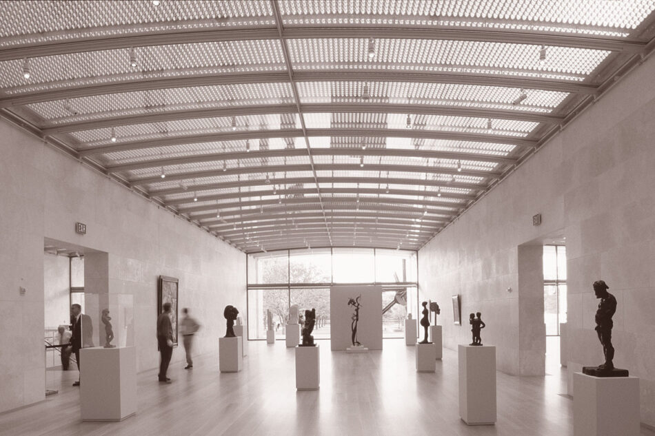
At the Nasher Sculpture Center in Dallas, Renzo Piano and the Renzo Piano Building Workshop offer us a subtle, intelligent, elegant restatement of one of the great late-20th-century public resources, the contemporary art museum. Piano’s Nasher importantly starts not from a tabula rasa, but as an elaboration and interpretation of possibly the strangest and finest of all of these, Louis Kahn’s Kimbell Art Museum in Fort Worth, Texas. Starting with the claim that the Nasher too is a “ruin” of parallel masonry walls, Piano grabs Kahn’s paradigm by its roots in the ancient Roman Porticus Aemilia. With his parallel walls, Piano makes open-ended storerooms like those of the Porticus and like the concrete “cassones” Kahn assembles for the treasures of the Kimbell. He assembles his storerooms in a simple modular line as does the Porticus, leaving to Kahn the exquisite subtlety of the Kimbell’s ultimately nonmodular composition. In place of Kahn’s ingenious, hard-working, tilted beams, Piano then puts over his storerooms an exquisitely light vaulted mesh of molded steel. The vaulted mesh combines, in a near infinity of openings, Kahn’s famous slot and light diffuser, evenly distributing a comparable silvery light. The moiré of the mesh once again makes available for the art-watcher Kahn’s connection with the changing light of the sky, but tuned down to meet contemporary standards for art conservation.
Piano’s Nasher is a high homage to Louis Kahn that revisits both the Kimbell and their common ancestor by the lights and means of our time. At the same time, Piano sets a scale and tone for the re-expression of the paradigm that is, like Kahn’s work generally, deeply and intensely human, with none of the “gee whiz” Baroque dazzle of so much pre-World Trade Center Postmodern work. That Piano’s renascent humanism, the work of a contemporary “homo faber,” has been picked up by so many important institutions—the Pierpont Morgan Library, the Isabella Stewart Gardner Museum, the Whitney Museum, and Columbia University to name just East Coast examples—allows the hope that it is a trend that will help deal with the violent wrong turn of our response to the World Trade Center, evidence, that is, of a needed shift in sensibility.
Piano’s Pierpont Morgan Library addition shows what this architecture can do to set an important humanist institution in a promising contemporary direction. The Morgan Library started with the “villa” Charles Follen McKim built so that Pierpont Morgan could personally enjoy his treasures and use them to entertain and impress his friends. Set up and back from the street, the beautiful white Beaux Arts villa stood, among other things, for the wealth and sense of right of one of the masters of the 19th-century imperial universe. When the Morgan library went public after Morgan’s death, Morgan’s son added an adjacent annex by Benjamin Wistar Morris, a post-First World War Beaux Arts box that rather reluctantly opened itself to the world. The Library much later acquired the Renaissance revival brownstone residence of Morgan’s son, an acquisition that was useful but only confused the Library’s architectural self-representation. Coming into the 21st century, looking to increase its contribution to the cultural life of the nation, the Morgan had extraordinary treasures, several potential front doors facing different streets, and three good old buildings making relatively irrelevant representations of the contemporary library.
To get to Piano, the Morgan made an important choice to abandon visionary proposals it had just acquired in a private competition. Piano started his scheme by sorting out the entry, placing the single new front door on the major public street, Madison Avenue, away from Morgan’s private villa, and creating behind the new entry a sky-lit public assembly space that gave comparable access to all buildings of the combination. To bring the old and new together, he added not one box but three more in the same scale as that of the old, honoring the old in kind but essentially out-voting those boxes to make the dominant voice the abstract, elegant modernity of the new. The box that controlled the front door and gave public access to the treasures clearly announced where the Library was going, not where it had been. The dominant representation of the Library was no longer what it had done for Pierpont Morgan, but what it could do for us.
Piano’s addition is a graceful display of contemporary technology and materials wound in with but firmly controlling the old. In its elegance, it fits with the Morgan’s characteristic riches, and by its intelligence and strength it turns towards its contemporary mission. The addition lifts the Library out of the confines of its old architecture and makes both the new and the old work for contemporary needs. Piano’s other institutional work is not yet off the boards—except, that is, for the Whitney Museum, which has come out just far enough to be zapped by New York’s fiercest preservationists. As this and other New York cases show, an enormous amount remains to be done to continue to secure for great old buildings the benefit of the additions that help them deliver all they can as instruments of human service. Meanwhile these additions make clear what we can continue to hope for on that score from the boldest, most creative and insightful contemporary architecture.
Of pebbles which the waves draw back, and fling,
At their return, up the high strand,
Begin, and cease, and then again begin,
With tremulous cadence slow, and bring
The eternal note of sadness in.